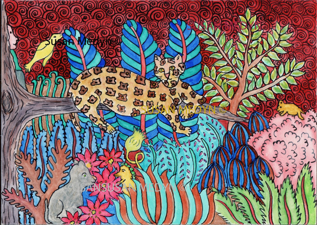
I struggle to achieve mastery over color. It is one of my major challenges. I tried to have a more mature palette by mixing complimentary colors. My goal was to create a jungle scape that was more harmonious. I am seeing new possibilities in coloration.
Now the challenge is to stay the course.
This is a 7″ by 5″ ink and watercolor on Aquabord framed in a shadowbox frame.
SOLD





Beautiful contrast! I love the powerful red sky!
Very nice and bright!
Ooouu! I love this! Wonderful colors, and your plant life is so lively!
Using a mix of bright colors always takes courage. I have a poster of a Matisse painting hanging in my office. It uses a similar palette to the one you’ve used in this piece. Both are bold and beckoning. On yours, I especially like how the use of turquoise draws your idea to the gravel leopard—bravo!
Thanks for including me.
Bravo! New work……love the fantastic colors, patterns, and textures. Very spring appropriate!