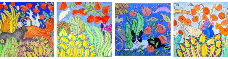
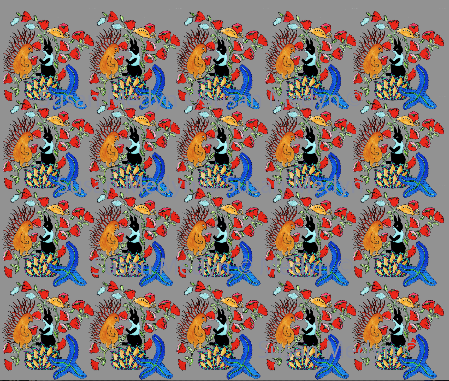
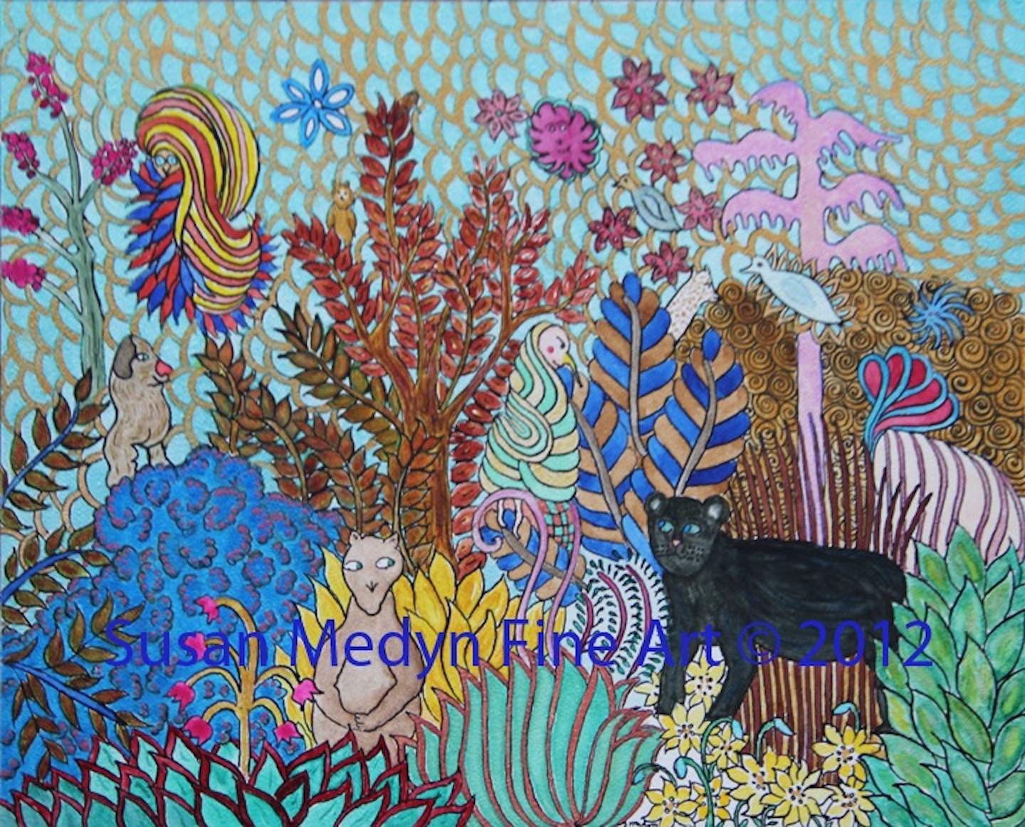
I am having fun working up a series of patterns from my mercat bunny series. This is from the recent Frank and Alice image. I am reworking the painting to flow the poppies down toward the blue foreground plant. I think that will help balance the blue color and allow the pattern to be closer to itself.
What do you think?
What would you like to see this on?
And any background color thoughts?
I have been playing with shades of beige, orange and pink. So far gray has won out.


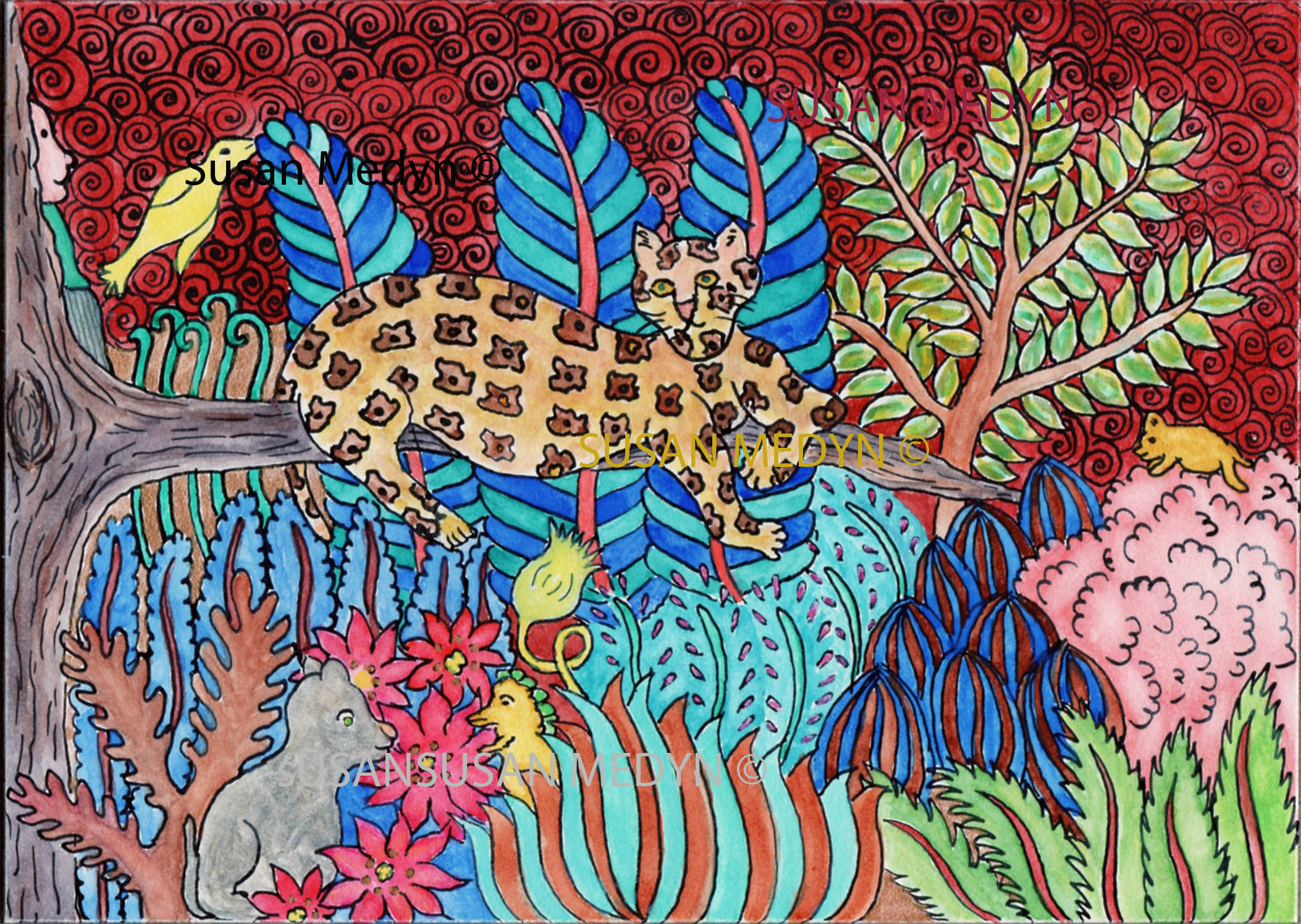
Ohhhh, lovely!
I would like a cute summer dress with this!
What a great idea!
Very nice! I love it and I like the grey background, too.
Of course, it screams “fabric design!” I love it and it could be applied to a lot of uses.
These would be great on fabric…..see Spoonflower.com…..
So pretty and vibrant! Really nice flow with the poppies. (I don’t know anything about making patterns though!) I can’t decide about the gray background. I might try pale blue, but I can see you have pale blue flowers. Maybe something a bit more silvery gray? It’s so hard to guess without trying it out!
Susan – this is fabulous! Would be darling on wallpaper or wrapping paper! I am a “pink” girl — so I was wondering about pink for the background — but, i have to say that gray really makes the red poppies pop! they might not show up near as much on a pink background. You know what you are doing – trust your instincts!
Linda
Looks great. It could be used on lots of products 🙂 What about a lighter shade of grey? Would be good on pink too, light lavender…
I want that as wall paper in my loo! 🙂 – Susan Smith
Love it, Susan – WHAT FUN!!
I am partial to this grey background, myself…